Colour finds its place.
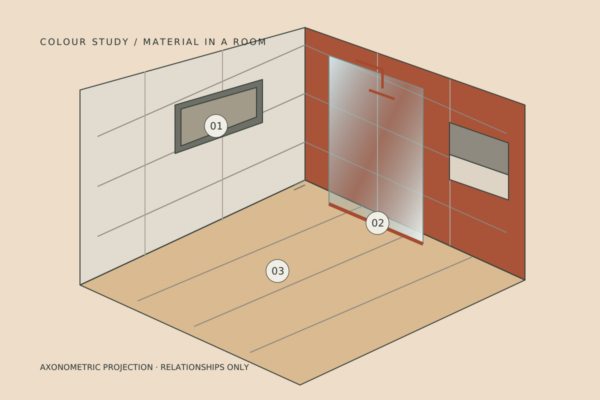
A glaze feels different when it becomes a splashback, a return or one quiet wall. These concept room studies explore the balance between a colour field and the materials around it.

Material drawing of a room with oxide tile, pale stone and glazed surfaces
A material study, rather than a completed client room.

Three material conversations.

The warm kitchen

Oxide carries the colour; Chalk gives it breathing room. Timber adds warmth without trying to match the ceramic. Look at the worktop edge and the window return together.

Explore the warm kitchen

The quieter corner

Chalk and Sage share a lower contrast. A distinct joint or edge can still change the reading of the whole wall. Compare samples beside the actual floor.

Explore the quieter corner

A little depth

Ink with a small Honey accent creates a stronger contrast. Decide whether the deep colour is a background or a focal area before extending it around the room.

Explore a little depth

Read the room as a whole.

Colour area
A sample is small. Mark the intended extent on a sketch so you can judge the balance.
Materials beside it
Bring an actual timber, paint or worktop sample when possible. Similar colours can have very different undertones.
Interruptions
Doors, fittings and shelves divide a surface. Agree where the visible edges begin and end.

Your room will have its own balance.

Carry the study you like into an envelope, then describe what is different about your space.

Start a room envelope