Colour · 20 January 2026
Colour you can live with
A palette is a material. If you would not paint a room in it, do not paint a brand in it.
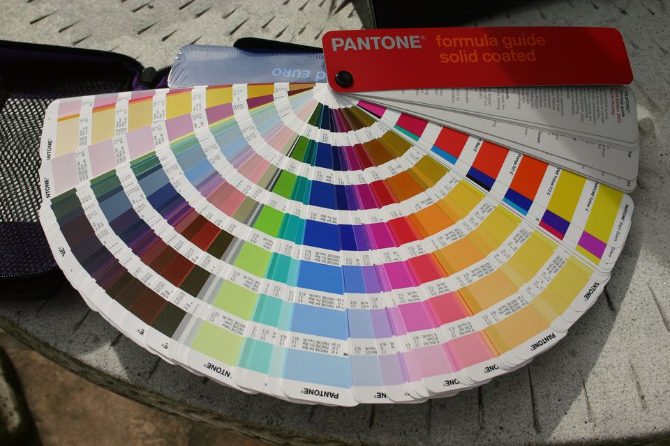
Most palettes fail in week six, when someone has to put the accent on a form label and the contrast falls over. The colour was chosen from a mood, not from a sentence of body text.
We separate colour that carries meaning from colour that carries reading. The first can be vivid and rare. The second has to pass on the paper you actually use — warm white, not pure white, and again in dark mode if the product has one.
Five colours is usually plenty: a deep, a working ink, a paper, a quiet support, and one accent you are willing to repeat. A sixth colour should have a job, not a feeling.
If you want to test a palette properly, stop looking at the swatches. Set a paragraph, a button, a price and a disabled state. The Palette Lab on this site does the contrast arithmetic so the argument can be about taste, not about a ratio you hoped was fine.
A studio note. Not a case study, and not a claim about a real client.