Identity · 12 February 2026
On leaving room in a wordmark
A name has to survive a stamp, a favicon and a tired Tuesday. Tight lettering rarely does.
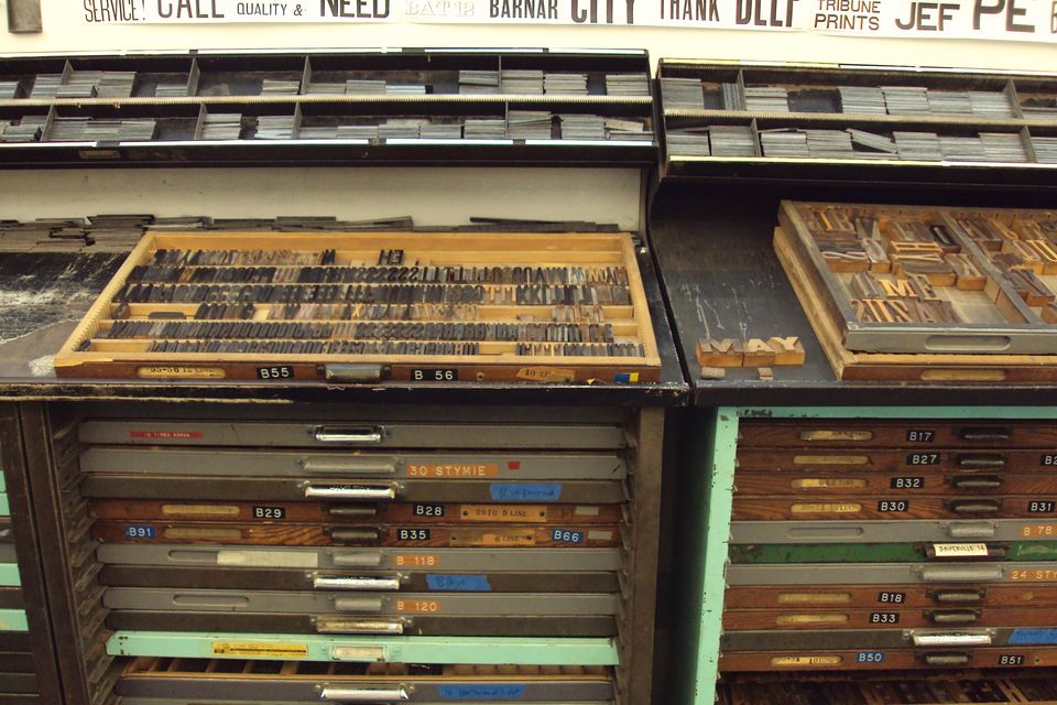
The first version of a wordmark is usually too proud of itself. Letters touch, tracking is fashionable, and the whole thing only works at the size it was drawn.
We start by setting the name in a face we trust, then we take space out slowly — not until it looks expensive, but until it still reads when it is small, stamped, or embroidered by someone who is not us.
Room is not emptiness. It is where a system keeps its options: a second line, a language, a registration mark. If the wordmark uses every available millimetre, the rest of the identity has to shout to be seen.
A useful test is unkind. Print it at 12 millimetres. Look at it in a doorway. If you have to explain which letters are which, it is not finished, however fine the drawing.
A studio note. Not a case study, and not a claim about a real client.